I’m a data-driven guy, both professionally and in my training, but in both sides of my life, numbers alone don’t tell the entire story. Words, feelings, tone, etc. all provide a qualitative dimension to what would otherwise be pure numbers, which you can interpret often any which way you want (“lies, damn lies, and statistics”).
A recent example of numbers not telling the whole story is my company’s analysis of Twitter for Super Tuesday — the numbers of positive posts for each candidate alone were not accurately predictive of outcome in 5 of the 10 states. However, if you look at the data more closely, you’ll note that we did get the most populous states — the ones we had the most geo-coded data for — we did get it right. That at least puts our 5-5 record in a slightly better light. 🙂 We did go out on a limb with USA Today in a pre-Super Tuesday article as well as a post-event analysis, and we ourselves didn’t believe we would get every state right, in particular the ones where we had very low numbers of tweets and where the difference between candidates wasn’t large. In this case, more data would likely have been better.
More interesting, though, is the qualitative data behind it — what did people say about the candidates and issues that would explain the why behind the results? We provided some of the insight here, but we have a lot more behind the scenes that we haven’t yet made public.
With my triathlon training, balancing the quantitative with the qualitative is a different exercise. I’m an experiment of one, so large numbers of experiential data from other athletes can tell you a lot about what has worked in general, but you still need to map the numbers to your own situation. High volumes of training that work for some athletes break other athletes.
This is where I’ve been using TrainingPeaks’ Performance Management Dashboard to help me look at how I’m progressing over the course of my buildup to Ironman St. George. I’ve been investing a lot of time and effort in cycling, since I come from a running background and have that leg pretty much nailed as long as the bike doesn’t take too much out of me. I’ve been following Coach Troy’s Spinervals Super 6 challenge, and it’s worked well for me — I improved my 20-minute threshold power number by 13 watts in the first six-week phase, and am looking for more in the second phase.
This improvement hasn’t come without cost, though. I had a sub-par half marathon in Austin in mid February (a 1:28:30, which normally would be a moderately hard training run, but on that day was “all out” on a pretty hilly course), and in general I’ve been feeling pretty tired on a lot of days.
Looking at my Performance Management Chart, I can see a couple of things happening:
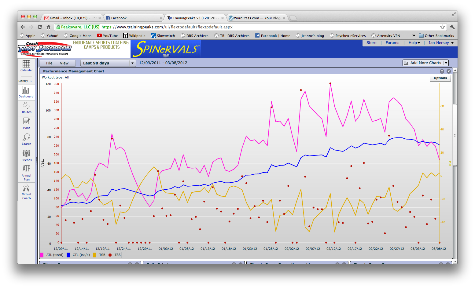
First, my CTL (Chronic Training Load, the blue line) has been on a steady increase over the past 90 days. This is a good thing. I’m averaging above 70 TSS points a day on a consistent basis (the CTL in my case is a weighted average over the past 42 days). The pink line, my ATL (Acute Training Load), reflects my activity over the past seven days. The difference between these is my Training Stress Balance (TSB), the yellow line. You can see that that has been negative for some time, which pretty much explains why my one race wasn’t good and also why I generally feel tired.
This week, however, I’m on a little family vacation in Hawaii, and I didn’t take my bike (I’m on Oahu, which is not the most bike friendly of islands), which means I’m using the stationary bikes in the fitness center where I’m staying and not putting in really long rides. I also don’t have power data being uploaded (the bikes do display watts, however), so my TSS scores are being calculated based on heart rate data, which is ok but not the same. Anyway, the bottom line is that it is a true recovery week for me, and the numbers bear that out.
Qualitatively, I’m starting to feel less tired. After a few hectic days (the Super Tuesday stuff mentioned earlier) of “working from paradise,” I’m also now catching up on sleep (9+ hours last night), and that also seems to help. Which brings us to the topic of “incomplete data”: although TrainingPeaks provides for the analysis of nutritional data and other metrics, it’s a lot more work to enter that stuff, so I basically don’t do it. However, that means that my analysis by definition is based on incomplete data; how well you eat, how much you sleep, how stressful other parts of your life are — these can all affect your training, your relative feelings of fatigue, even your day-to-day level of motivation to train hard.
It’s just like with the primaries and social media — we know where some tweets are coming from, and we can analyze the language in them to know who and what they’re talking about, but we don’t, for example, know whether they’re actual voters, whether we’re looking at a second or third account from the same person, exactly what their age, sex and political/religious/etc. affiliations are, so the data is incomplete. But in the aggregate, it still tells you a lot about the issues facing the candidates, their relative chances of success both now and in the general election, and which messages are resonating with the public.
So I guess the lesson is that data will necessarily be incomplete, but it’s still useful if you know what to listen for.
